CAD, A User Interface Re-considered
01 08, 06 Topic: Shark & ViaCAD
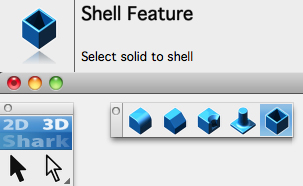
Shark FX redesigned topbar, toolbar and tool palettes
This commission from software developer Tim Olson was to reconsider the CAD interface for what were to become mainstream CAD products Shark and ViaCAD.
The tools and the way they are presented to the user were to be completely reconsidered for the new applications. This included the workflow and dialog boxes for the tools. Clarity and simplicity would not only better present the program, but would also help users learn and navigate to the right tool quickly.
Colour coding was reviewed, effectively splitting the tools into various vivid colour categories : black for lines, green for surfaces, blue for solids, magenta for animation tools and so on. Respective objects would be drawn in these colours by default.
The icon sets are arranged in the application folder as ‘Skins’ allowing icons or entire icon sets to easily be replaced altogether. For example, a replacement set of desaturated icons is available from the Punch! Blog for those who prefer less bright colours.
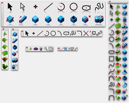
Shark FX and ViaCAD Icons at various sizes, with and without transparency
Because tools have to be represented hierarchically in different ways in the various disparate parts of the interface, each icon had to be tuned to be presented at 4 different sizes. In all, almost 2000 icons needed to be made. An added advantage of this approach is that the interface can be customised with icons between 16 pixels and 64 pixels and as the icon sets are produced via photoshop scripts, the focus of the work can remain the master icons.
All the icons included an alpha channel, meaning that they could be used without backgrounds, allowing them to sit on top of objects without entirely obscuring them. Palette backdrops could also then be modified in future software releases regardless of platform without requiring further work.
Shark FX and ViaCAD Application Topbar
A new topbar was created along the top of the screen. This would provide a really big clear icon and descriptive information in large text to summarise the tool’s purpose. Progressively smaller text would then provide ‘step through’ detail on how this tool may be used and even (optionally hidden) ‘tool hints’ on getting more out of each tool.
Shark FX and ViaCAD Application Icons, also redesigned
<Tweet Pin it Share on LinkedIn Share on Google+ Send email
Colour coding was reviewed, effectively splitting the tools into various vivid colour categories : black for lines, green for surfaces, blue for solids, magenta for animation tools and so on. Respective objects would be drawn in these colours by default.
The icon sets are arranged in the application folder as ‘Skins’ allowing icons or entire icon sets to easily be replaced altogether. For example, a replacement set of desaturated icons is available from the Punch! Blog for those who prefer less bright colours.
Shark FX and ViaCAD Icons at various sizes, with and without transparency
Because tools have to be represented hierarchically in different ways in the various disparate parts of the interface, each icon had to be tuned to be presented at 4 different sizes. In all, almost 2000 icons needed to be made. An added advantage of this approach is that the interface can be customised with icons between 16 pixels and 64 pixels and as the icon sets are produced via photoshop scripts, the focus of the work can remain the master icons.
All the icons included an alpha channel, meaning that they could be used without backgrounds, allowing them to sit on top of objects without entirely obscuring them. Palette backdrops could also then be modified in future software releases regardless of platform without requiring further work.
Shark FX and ViaCAD Application Topbar
A new topbar was created along the top of the screen. This would provide a really big clear icon and descriptive information in large text to summarise the tool’s purpose. Progressively smaller text would then provide ‘step through’ detail on how this tool may be used and even (optionally hidden) ‘tool hints’ on getting more out of each tool.
Shark FX and ViaCAD Application Icons, also redesigned
<