
CAD Bites Back !
25 05, 11 Topic: Shark & ViaCAD
It was always clear to me that CAD was inextricably linked to my future in design. As a critical element of tomorrow’s design process, I confess it has often frustrated me. Now with 20 or so years experience in design (and CAD), I can confidently state that as a process, it is no longer teething and is an indispensable part of my workflow.
I wasn’t fortunate enough to be one of those designers who could leave CAD alone entirely. The promises were too intoxicating.
Electrified by the potential benefits that CAD would bring, I bravely rolled my sleeves up and got stuck into learning how to design for the digital age.
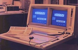 I started in around 1990 with Intergraph’s EMS system - The ‘Electronic Modelling System’. I was at design school in Sheffield, England - one of only a couple of ‘lucky’ budding designers chosen to be thrown into the mysterious and murky waters of this new media.
 A similar sorry excuse for a design tool was also installed at the design school in Eindhoven, Holland (by Phillips Electronics) which I was visiting as an exchange student. This big bird however was much more powerful than Sheffield’s duck and had no less than two monitors with which to see multiple simultaneous views. (A fact somewhat lost when you consider the object it best handled was a cube).
Once the two-eyed beast had awoken and chomped its’ leisurely way through an eternal breakfast of boot process spaghetti, it finally spewed some crude excuse for a User Interface onto the inside of the lefthand tube ... and was time to change the world.
Womanikin - (like Manikin, but em ... not). My first CAD model
It was very impressive to us, of course. For the first time ever, a ‘rolling ball fillet’ could work itself half way around an entirely un-shellable primitive. In reality, it was close to useless. All the more so due to my youthful inexperience at the time and the lack of appropriate learning support available.
We should have heeded the warning signs. CAD was crap ! Those who had practised CAD avoidance were undeniably the victors.
 For decades following, CAD continued to over promise and under deliver, wasting untold development time and adversely affecting the hairline of believing designers like me the world over. Salesmen would mercilessly hoist their well-honed “design your product in three easy stages” routines on naive designers. Oh how we wanted to believe !
 It was the first time I had seem promising, affordable CAD running on cheap hardware and I was very excited at the possibilities. Whilst the promise was strong, it was apparent that the software was hopelessly immature. Teaching the principles of CAD was about all it was good for - using this tool for real design work was well beyond reach.
 CAD is only now becoming mature. It finally does (more or less) what it says on the tin.
So, if you’re starting out with CAD now … lucky you - There’s never been a better time ! Spare a thought though please for all the designer guinea pigs who have helped get us to this point.
Many thanks to Tim Olson for the incredible journey he’s made in getting us to this point and for the terrific Shark and VIACAD users for supporting it’s development along the way.
Savannah Rocker III, developed in Shark
Shark and ViaCAD are products of Encore Software, in which I have no stake - other than making the odd tool icon and reporting the odd bug. I’ve used Shark and it’s predecessor applications in all aspects of my design work since 2000.
Comments above are personal opinion only.
<
Electrified by the potential benefits that CAD would bring, I bravely rolled my sleeves up and got stuck into learning how to design for the digital age.

Double vision - Intergraph’s space-age EMS system
For all the promises, and despite the aid of a very supportive tutor, frustrations were many and the rewards were few.
If CAD were a bird, it would be the one you eat at Christmas. The months I spent wrestling with this ugly flapper should have been enough to make me vegetarian for life.

Once the two-eyed beast had awoken and chomped its’ leisurely way through an eternal breakfast of boot process spaghetti, it finally spewed some crude excuse for a User Interface onto the inside of the lefthand tube ... and was time to change the world.
Womanikin - (like Manikin, but em ... not). My first CAD model
It was very impressive to us, of course. For the first time ever, a ‘rolling ball fillet’ could work itself half way around an entirely un-shellable primitive. In reality, it was close to useless. All the more so due to my youthful inexperience at the time and the lack of appropriate learning support available.
We should have heeded the warning signs. CAD was crap ! Those who had practised CAD avoidance were undeniably the victors.

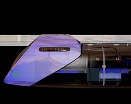
Rapid Transit System for London, c.1992
From EMS, I went on to learn CDRS, the grandly termed ‘Conceptual Design and Rendering System’ at the RCA in London. It was installed by industry to promote the student use of CAD to the future benefit of the car companies. It ran on machines which wouldn’t have looked out of place in Kubrick’s ‘Space Odyssey’. Very big, very noisy, very NASA, very impressive, very techie … but on the whole, time and money sucking and critically flawed in a multitude of infuriating ways. Designing objects using such state-of-the-art design tools was an exercise in futility for most and for the hardy few who refused to be beaten, something close to masochism.
RCA, Rendering from CDRS. Jolyon Yates c.1992
For me, a feint light of hope began to twinkle when the automotive studios started changing from CDRS to Alias StudioTools. For the first time, the tools were presented beautifully and the tools were on the whole robust. The machines however which ran such software were still expensive and the software, often even more so. Alias offerings were at last promising, but when they later became available on PCs, they were still dillusionally expensive and there were still a multitude of expectations I had for them which were not about to be met.
I had meanwhile begun teaching design at a University in New Zealand and by chance came across Tim Olson, an American software engineer who had developed a CAD system for Lockheed Martin and was now responsible for the development of various licensed CAD offerings on the general PC market. I was tasked with teaching the fundamentals of CAD to young design students and given tight restrictions on budget and a lab of old Apple Macs, software from Tim’s stable was the only show in town.

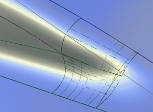
Alias Wavefront - modelling complex surface intersections c.2000
That was 1999 and as the years went by, Tim Olson and his partners worked tirelessly to improve their technology. Each year brought better and more sophisticated tools. Components were gradually debugged, improved and stabilised. It became apparent that Tim was dedicated to making the kind of tools that would ultimately serve my design needs well. Along with a dedicated hardcore of users, I determinedly bombarded Tim with all the feedback I could muster. I was now using the software daily and each new session brought renewed feedback for Tim. To his credit, Tim listened carefully and would often develop solutions to a user’s problems on the fly.
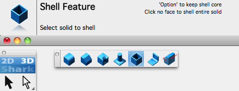
Shark FX and ViaCAD’s redesigned Application Interface, c.2011
In 2005, as part of a product revamp, Tim commissioned me to help him revamp the User Interface. Much time was spent designing new tool icons and rejigging the way the program and it’s tools were presented to the user. As a result of all that hard work and much since on the part of Tim and his team, I don’t think there is a more approachable CAD system out there.
A few more years of development have passed and as I reflect on the 20 or so years of my experience with CAD in design, I finally feel placated in my decision to invest my time in learning CAD.

So, if you’re starting out with CAD now … lucky you - There’s never been a better time ! Spare a thought though please for all the designer guinea pigs who have helped get us to this point.
Many thanks to Tim Olson for the incredible journey he’s made in getting us to this point and for the terrific Shark and VIACAD users for supporting it’s development along the way.
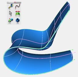
Savannah Rocker III, developed in Shark
Shark and ViaCAD are products of Encore Software, in which I have no stake - other than making the odd tool icon and reporting the odd bug. I’ve used Shark and it’s predecessor applications in all aspects of my design work since 2000.
Comments above are personal opinion only.
<
